
The Visual Humanities and the Future of Communication
By Maggie Sattler
Review of Graphesis: Visual Forms of Knowledge Production by Johanna Drucker (Harvard University Press, 2014)
[print_link] [email_link]
In “How E-Reading Threatens Learning in the Humanities,” a July 2014 article in The Chronicle of Higher Education, Naomi S. Baron, a professor of linguistics whose research interests include writing and technology, contends that when her students read on digital devices, their attention spans and abilities to retain information shrink. This piece opens with a student arguing that Baron was assigning too much reading. Why spend long hours reading when one can just use advanced search functions to find the meaty stuff?
In Graphesis: Visual Forms of Knowledge Production Johanna Drucker, a professor of information studies at UCLA, looks at such challenges from quite another, and far more optimistic, angle. Drucker argues that when human beings are addressed as mere users of texts and other pieces of recorded knowledge, they are disempowered and respond weakly. But if sophisticated information and interface design treats the same people as subjects with advanced cognitive and interpretative abilities, they may respond quite differently, engaging much more deeply with the materials on offer. In Drucker’s world, humans are not robotic consumers; they are dedicated subjects with advanced capabilities to interpret, understand, and create new knowledge. When capably designed texts or graphics are executed with this in mind, the output is considered “humanistic.” One example of humanistic interface design Drucker considers exemplary is the Vincent Van Gogh Letters Project, published by the Van Gogh Museum in Amsterdam. This site allows a visitor to discover Van Gogh’s correspondence either by period, by correspondent, by place, or with or without sketches, and so forth. Drucker says that this shows how “the fundamental considerations structuring the interface arose from the belief that these aesthetic materials would be studied, used, and analyzed, not consumed.”
Among other things, Drucker believe it is important to design for individuals, who come to texts and visual presentations with their own unique knowledge and perspectives, borne of their own unique histories and circumstances. From this perspective Drucker imagines possibilities for digital tools that, when harnessed correctly, could amplify the experiences of reading and critical thinking.
A widely published scholar in the fields of graphic design, information studies, and the digital humanities, Drucker’s books include Graphic Design History: A Critical Guide (2008) and SpecLab: Digital Aesthetics and Speculative Computing (2009). Her expertise in visual studies, passion for complex humanistic graphics, and academic interest in user interfaces are most elegantly combined in her latest book. Graphesis, appropriately full of images and illustrations, is a complete volume of work that build upon a single theory, parts of which have been previously published online, toward rehumanizing that which is lost in today’s average interface, whether in print or electronic form. Graphesis is part of Harvard University Press’s metaLABprojects series, which “invites readers to take part in reimagining print-based scholarship for the digital age.”
The book argues for several basic changes in approach to the ways information is recorded and presented, three of which will be broken down here. First, Drucker proposes doing away with the mainstream conception of “data.” The etymology of this word is literally “that which is given,” and this definition ignores the fact that data are the products of human interaction. And thus she proposes replacing “data” with a more accurate term: “capta,” or “that which is taken.” She writes:
The graphical force conceals what the statistician knows very well—that no “data” pre-exist their parameterization. Data are capta, taken not given, constructed as an interpretation of the phenomenal world, and not inherent in it.
This statement, and the challenge to traditional approaches that it embodies, form the base for the rest of the deeply theoretical matter of the book.
Secondly, Drucker proposes an “essential” move for anyone working in the humanities. Take, for example, your average pie chart. It is made up of metrics that have been standardized to add up to a neat 100%, each slice of the pie comprised of statistics that have been recorded and standardized, perhaps rounded up or down, to fit this norm. Such standardized metrics only contribute further to the disempowerment of the reader; they are published on a platform that lends the metrics an unnecessary air of authority, favoring one story about the information over another. As a solution, Drucker is interested in pursuing an idea about what expressive metrics would look like. To illustrate, she provides two examples for comparison: the first, a simple bar graph using standard metrics that show the number of books published by a particular publisher between the years 1855 and 1861.

This is great and fine and a familiar piece of data visualization. Drucker argues that it is overly simplistic. It makes the underlying assumption that each book’s life and death in the publishing cycle begins and ends in the year in which it is published. It makes no room for the often lengthy acquisitions process, the processes of writing and editing and copyediting and design, and the fact that some books are canceled before they are published—to name a few factors. The traditional bar graph doesn’t just reduce these stories—it ignores them altogether. Drucker re-envisions the story like this:
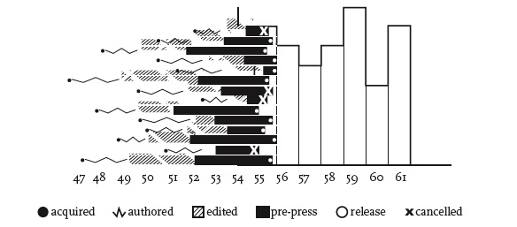
Here, we have a bar graph that requires more explanation, but also gives more information. It concentrates on a single year of books published and has been altered to depict the processes of acquisition, further writing, editing, and production. Some books reach publication; some are cancelled before they are released; all have existed in some form that deserves documentation. The graph does not claim to be comprehensive, and nor should it—for what about a book’s life after its publication? What about the marketing strategies and documents of public reception that follow a book well after its publication date? Are these not just as important as the processes that went into its publication? The more complex bar graph is also incomplete, but that appears to be Drucker’s point: to get her audiences to think about the nature of data vs. capta and about their representation. Imagine the possibilities for information and interface designs that display uncertainty, mood, and affect, and even offer nuanced views of space and time. For example, some minutes, hours, and days seem to go by faster or slower during different experience. In SpecLab Drucker explores how temporal modeling might represent time according to its situational context, according to our lived experience of time.
Drucker seeks to promote information and interface design that does not ignore the contexts out of which “capta” emerge. She is interested in how individual experiences can be portrayed graphically, and she is concerned by how human experience is misrepresented by traditional approaches to systematizing and recording “data.” I can say I live eight miles from where I work, but that information is only significant when taken in its situational context. Is it eight miles because I must rely on roads that do not represent a straight line from one location to the next? Do I have easy access to public transportation or a bike path that make the distance seem shorter or longer? Is the geographically shortest route through an area of high traffic, adding time to my daily commute? Is “mile” appropriate, or would some other measurement (25 minutes away) better represent the distance in some contexts? Such details are significant to understanding the measurement in terms of my experience with it.
Thirdly, Drucker wants to point out that the act of interpretation has a performative nature. Only when the visual tools we use to represent and record knowledge reach a certain degree of complexity will they be able to match the sophistication of our cognitive processes. We’ve previously discussed a trending conversation about how engagement with electronic devices threatens learning in the humanities. But in their current state, such e-books are really only print books made digital—but still based on the fundamentals of design for print books. They are not interactive. They do not harness the capabilities of new interface design. In fact, Drucker reimagines the future of the book as a form that will combine processes of reading and writing and incorporate social media, links, even data mining, and represent the processes of analysis.
It is a point in Graphesis’s favor that it raises as many questions as it answers. For example, Drucker praises the We Feel Fine (wefeelfine.org) project. This site “reads” emotional indicators recorded on personal blogs and on social media feeds such as Twitter and Facebook. Drucker proposes that it is “a pulse, an indicator, a living system in which collective emotional life is registered.” But are Twitter updates genuine reflections of emotions? And what is the relationship between public expressions of emotion and our more private feelings? And, more simply, how does this “pulse” recognize if and when a blogger is being sarcastic? Following Drucker’s own approach, we would want to account, too, for how the designer of the “pulse” and the technology of it were themselves interpretations, subjective.
I would also note that sophisticated design can be expensive. The New York Times, for example, has invested in an array of innovative ways of presenting information. Its 2014 “Is It Better to Rent or Buy?” interactive visualization allows visitors to manipulate sets of data and explore particular outcomes of various scenarios. Its 2012 project “Snow Fall: The Avalanche at Tunnel Creek” harnessed the interactive possibilities of the Web to provide an innovative multimedia storytelling and reading experience. While the New York Times has been heralded for its amazing graphic work, the organization has also dedicated great expense and resources in terms of time to these endeavors. Despite the incredible output, the outlet still struggles to generate new revenue, having just this month announced another round of layoffs. This raises a pragmatic question: How well can a humanistic approach to mainstream infographics work if it requires resources that many organizations simply do not have?
Approaches to information and to reading are changing with the times. How can we use new technology in new ways rather than criticizing it for its perceived shortcomings? Graphesis is dense and theoretical and speaks most directly to information and interface designers, as well as to academics in the field of digital media studies. The language of the book is not always friendly to non-specialist readers. Yet, at the same time, Drucker makes arguments that deserve consideration by all who are concerned about the future of reading. We need to wrestle with the questions this book raises.
Moreover, designers are playing a lead role in the evolution of the book, and thus in how we write, read, and take in information. It is well worth our time to pay attention to designers’ thinking and to the possibilities they are exploring. What Drucker offers in particular could be called an ethical approach to information and interface design in the sense that her proposals incorporate human experiences, capabilities, and even limitations. And in so doing, she makes a strong case not only to consider the possibilities that electronic interface can offer, but also to bring humanities disciplines into conversation with their technical and scientific counterparts.
 Recommended reading/viewing
Pixel Dust: Illusions of Innovation in Scholarly Publishing, Los Angeles Review of Books, January 16, 2014.
Humanistic Theory and Digital Scholarship, essay in Debates in the Digital Humanities, 2013 (open-access edition).
Humanities Approaches to Graphical Display, Digital Humanities Quarterly, 2011.
Humanistic Approaches to the Graphical Expression of Interpretation, video panel hosted by MIT, 2010.
Credits
The two embedded images are from DHQ article in the recommended reading (Humanities Approaches to Graphical Display) and credited to Xárene Eskandar.
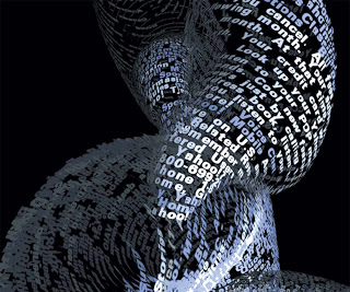
Image at the top is a sculpted poem by the designer Ben Fry. Accompanying text states that an alternative Web browser called “tendril . . . constructs typographic sculptures from the text content of web pages.”
Image at right is a Connecticut map credited to Frances Henshaw, 1823; from the Library of David Rumsey. Appeared in a digital humanities article on “Inventing the Map,” by Bethany Nowviskie.
N.B.: Neither of these images are from Johanna Drucker’s Graphesis.
